Even though the calendar indicates it is officially "spring", the actual weather here has been more winter than spring. Every night I still have to bring all my art supplies in from the car and then re-load them all in the morning before I leave to teach at whatever school I'm scheduled for on any particular day. Today the school was in Winifred, a small town about 50 miles north of my studio. The day was sunny with lots of interesting clouds and plenty of gentle winds. Here's a panoramic photo taken from the road on the return home around 5 p.m. and about halfway home to Lewistown.:
Click on the photo to see a much larger version. The mountains in the far distance (toward the middle of the horizon) are the Big Snowies (which are just south of Lewistown) and the mountains that start at the left are the Judiths. The mountains to the left of center are the south Moccasins.
Wednesday, May 4, 2011
Friday, March 25, 2011
"Paper" Airplane Bench in progress . . .a couple more photos added
The City of Idaho Falls, Idaho sent out a Call To Artists last spring (2010) for bench designs; the selected benches would be installed in the City's Snake River Greenbelt Park. I submitted a concept for a "Paper" Airplane Bench. It was among the 20 designs ultimately selected but placed in the group of ten that had to wait for the next funding round.
So now it is spring 2011 and the bench is "taxiing for take-off!" Metal fabricators on this project are Warden Bourne and Jeff Martin, both of Lewistown. A big thanks to them for their expertise and abilities to modify a design as needed! I totally trust their work! Shane Ruckman (also of Lewistown) will apply the finish coat of industrial polyurethane, hopefully within the next week.
Below is a photo taken just this evening of the bench in the back of Warden's flatbed truck. I wasn't able to get a better photo because of lighting issues but will post a better photo when I can take one in the daylight and from a better angle. In this photo, the leading edge is all you can see of the wing:
The three "legs" are going to be coated in a neutral color that will "disappear" visually once the bench is installed. All edges and points are rounded so this bench will be safe for kids to play on.
This was the second time the City of Idaho Falls called for this type of competition. A few years back (in 2005) there was a similar Call To Artists to which I responded and was selected. The bench that time was a skateboard design, which you can see at EastMontProductions (scroll down the page at that website to see it.)
MORE PHOTOS . . . Nice sunshine the day after the evening I shot the photo above. Here are some more photos. Additional photos will be posted after the bench gets its finish coat.
This first small photo (at Left) shows how each of the three support posts hide the bolts. Arched opening allows finger/tool access for tightening or loosening bolts.
The next photo (immediately below) is a nice side view. I cropped out all the extraneous stuff in the background, as everything was about the same color gray as the bench's bare steel and didn't let the profile of the bench show up very well in a smaller sized photo.
Top view (photo at Right) shows seating surface. This bench gives sitters the option of facing in different directions yet still have a backrest support.
Last photo, another view that shows off the seating surface. Very comfortable! NOTE: Bench is 7 ft long and 4 ft across at the widest spread of the wings. Three 4-inch support posts: One about 2 ft from nose and one under each wing (and each set at 1 ft from rear edge of wing and 7 inches from side edge of wing.) Distance between front and rear support posts is about 3 ft. Approximate distance between front post support and rear support posts is 3 ft.
So now it is spring 2011 and the bench is "taxiing for take-off!" Metal fabricators on this project are Warden Bourne and Jeff Martin, both of Lewistown. A big thanks to them for their expertise and abilities to modify a design as needed! I totally trust their work! Shane Ruckman (also of Lewistown) will apply the finish coat of industrial polyurethane, hopefully within the next week.
Below is a photo taken just this evening of the bench in the back of Warden's flatbed truck. I wasn't able to get a better photo because of lighting issues but will post a better photo when I can take one in the daylight and from a better angle. In this photo, the leading edge is all you can see of the wing:
The three "legs" are going to be coated in a neutral color that will "disappear" visually once the bench is installed. All edges and points are rounded so this bench will be safe for kids to play on.
This was the second time the City of Idaho Falls called for this type of competition. A few years back (in 2005) there was a similar Call To Artists to which I responded and was selected. The bench that time was a skateboard design, which you can see at EastMontProductions (scroll down the page at that website to see it.)
MORE PHOTOS . . . Nice sunshine the day after the evening I shot the photo above. Here are some more photos. Additional photos will be posted after the bench gets its finish coat.
This first small photo (at Left) shows how each of the three support posts hide the bolts. Arched opening allows finger/tool access for tightening or loosening bolts.
The next photo (immediately below) is a nice side view. I cropped out all the extraneous stuff in the background, as everything was about the same color gray as the bench's bare steel and didn't let the profile of the bench show up very well in a smaller sized photo.
Photo at Left: Vertical stabilizer presents a flat panel rather than an open space (as a real paper airplane would.) This means no space for small hands to potentially get stuck in.
Top view (photo at Right) shows seating surface. This bench gives sitters the option of facing in different directions yet still have a backrest support.
Last photo, another view that shows off the seating surface. Very comfortable! NOTE: Bench is 7 ft long and 4 ft across at the widest spread of the wings. Three 4-inch support posts: One about 2 ft from nose and one under each wing (and each set at 1 ft from rear edge of wing and 7 inches from side edge of wing.) Distance between front and rear support posts is about 3 ft. Approximate distance between front post support and rear support posts is 3 ft.
Saturday, March 5, 2011
Kinetic Sculpture walks the beaches
Check this video out! Theo Jansen has assembled an amazing kinetic sculpture. The smoothness of movement makes me think of centipede and millipede insects scurrying sideways across a floor. Click: http://www.youtube.com/watch?feature=player_embedded&v=HSKyHmjyrkA
Thursday, March 3, 2011
"Mr. Snuffles" the Sadly Blue Basset Hound
He's big and he's blue. He's a teary-eyed personification of that Elvis tune "You Ain't Nothin' But A Hound Dog (Cryin' All The Time)" This was a fun project and I learned more about fiberglass than I thought I would ever need or want to know. "Mr Snuffles" is one of many artist-decorated fiberglass dogs and cats that will be auctioned to the highest bidder at an event to help raise needed funds for OFSA (Oregon Friends of Shelter Animals) a no-kill shelter in Beaverton, Oregon.
I was pleased with how this "critter" turned out. My only disappointment was not being able to affix the blue suede shoes onto the doggie's big fat fiberglass feet. The vest is a type of suede and I think the color is pretty against the doggie's blue body. (The vest is a dusty rose kinda color --- it may not show true to hue on the web but enough to give some idea of what the effect was..) The vest material co-operated and I was able to glue it into place. Then I added faux buttons to the vest back and music notes to the sides. The paint is artist's quality acrylic and sealed with a clear acrylic varnish in a mat finish (low gloss.)
Such sad eyes!
But he won't be so lonely and blue for long!
On Saturday, March 5th this life-sized hound dog
will go home with the highest bidder
and helping to raise funds
for OFSA.
When I get the rest of my photos sorted, I'll post a couple more views. What a cutie!
I was pleased with how this "critter" turned out. My only disappointment was not being able to affix the blue suede shoes onto the doggie's big fat fiberglass feet. The vest is a type of suede and I think the color is pretty against the doggie's blue body. (The vest is a dusty rose kinda color --- it may not show true to hue on the web but enough to give some idea of what the effect was..) The vest material co-operated and I was able to glue it into place. Then I added faux buttons to the vest back and music notes to the sides. The paint is artist's quality acrylic and sealed with a clear acrylic varnish in a mat finish (low gloss.)
Such sad eyes!
But he won't be so lonely and blue for long!
On Saturday, March 5th this life-sized hound dog
will go home with the highest bidder
and helping to raise funds
for OFSA.
When I get the rest of my photos sorted, I'll post a couple more views. What a cutie!
Wednesday, January 26, 2011
Etching Press - Session 5
Experimented with some more monoprints on the etching press. This time I inked the plexi-glass plate and carefully place a piece of either newsprint or rice paper over the ink. Then, using either a soft pencil or the rounded tip of the handle of a paint brush, I very quickly drew a line image on the paper. Once the drawing was done, I lifted the paper from the plate and the result was an inked line, with the drawing now in reverse. To conserve paper, I tried the same process also with two pieces of paper -- one next to the inked plate and a second piece on top of that. The drawing was executed on the top paper, with the transfer of inked lines going to the paper against the plate. The drawings done with the brush handle were the most fun and challenging because I couldn't see the lines as I "drew" them and could only guess at where one line left off and another might begin. Here are a few samples of the monoprints I ended up with:
I made several prints of cats in various poses. The intent was not to create the perfect line drawing of a cat, but rather to have fun with the quick line. The smudges seen on this print (at Right) and the others here are the result of using newsprint that had been wrinkled or buckled when it had been used as a protective layer between the press' pusher blanket and the inked plate with the dampened paper laid over it. The "used" newsprint touched the inked plate in places and picked up some ink in addition to the lines I was drawing. Both cat monoprints shown in this post were done with the handle of a paintbrush instead of a pencil.
In this second example I'd grabbed a piece of newsprint that had been used in the printing process the day I was experimenting with embossing. Two embossed circles are visible in the lower right near the cat's tail. I like the randomness of the lines, smudges and the embossing.
The next photo shows a close-up from this print. I include it here so readers can see what kind of line I was getting on the newsprint. The line is darker at its edges.
The next few photos show:
1.) The line print done in the same manner as the cats (also with newsprint that had been used previously.)
2.) A print pulled from running the plate and rice paper through the press after the line print was taken.
3.) A detail from the print shown in the second photo.
I made several prints of cats in various poses. The intent was not to create the perfect line drawing of a cat, but rather to have fun with the quick line. The smudges seen on this print (at Right) and the others here are the result of using newsprint that had been wrinkled or buckled when it had been used as a protective layer between the press' pusher blanket and the inked plate with the dampened paper laid over it. The "used" newsprint touched the inked plate in places and picked up some ink in addition to the lines I was drawing. Both cat monoprints shown in this post were done with the handle of a paintbrush instead of a pencil.
In this second example I'd grabbed a piece of newsprint that had been used in the printing process the day I was experimenting with embossing. Two embossed circles are visible in the lower right near the cat's tail. I like the randomness of the lines, smudges and the embossing.
The next photo shows a close-up from this print. I include it here so readers can see what kind of line I was getting on the newsprint. The line is darker at its edges.
The next few photos show:
1.) The line print done in the same manner as the cats (also with newsprint that had been used previously.)
2.) A print pulled from running the plate and rice paper through the press after the line print was taken.
3.) A detail from the print shown in the second photo.
1.)
2.)
3.)
Tuesday, January 25, 2011
Etching Press - Session 4
Today I took some time to create a few monoprints. A couple days ago I did some research and reading and concluded that what I'm creating are monoprints and not monotypes. I'll explain the definitions of the two terms in another posting later.
The imagery I worked up for today's press work were mostly grouse. I intended to try some loons as well, but got carried away with exploring the feather effects on the grouse. It was very entertaining, plus I discovered some more ways to make marks in the oil paint that I've been substituting for printing ink. Also, on the way to the studio, I stopped by our local glass shop and purchased an 11 by 14 inch piece of plexi-glass to use as my printing plate instead of the 8 by 10 inch paper-thin acetate that I'd used before.
Here is one of the grouse monoprints from this printing session:
The imagery I worked up for today's press work were mostly grouse. I intended to try some loons as well, but got carried away with exploring the feather effects on the grouse. It was very entertaining, plus I discovered some more ways to make marks in the oil paint that I've been substituting for printing ink. Also, on the way to the studio, I stopped by our local glass shop and purchased an 11 by 14 inch piece of plexi-glass to use as my printing plate instead of the 8 by 10 inch paper-thin acetate that I'd used before.
Here is one of the grouse monoprints from this printing session:
This is printed on the same kind of Japanese paper that I used in the earlier printing sessions. Using a rubber brayer,I rolled out the paint in an irregular rectangle shape. Then I wiped away the "air" (negative space) around the bird, leaving bits of the rectangle's edge to serve as a kind of border or "frame" for the bird. Rolling a coat of inck onto the plate and then removing areas from it to create the image is a reductive process/print. Had I started with an empty plate and then brushed the grouse on that would have been an additive process/print. I used a cotton rag to remove the white areas; if I removed too much, I simply painted it back in using a bristle brush. The sharp white lins were created using the edge of a small scrap of matboard
The final image measures about 8 by 6 inches.
Well, as I'm writing this, it's very close to turning into tomorrow. And Coast to Coast is on with some lively discussion about the State of the Union address. I think I'll make some hot tea and sit a little closer to the radio for a bit.
Sunday, January 23, 2011
My Studio Front Door
When I started this blog site in December 2008, I posted a photo of my studio building -- scroll down the right-hand column to see it.
Whenever someone asked me where my studio was located, I'd describe it as a large blue building immediately north of Highland Park Elementary School. The studio is on the corner of 7th Avenue and Hilger - or so one would think. But 7th Avenue bends slightly at Hilger and at that point 7th Avenue magically becomes 1st Street for the distance of all of a half a city block or less to where it "T"s with the truck bypass street. I was unaware of that little "detail" until one time I'd given driving directions as: "follow the truck bypass, then turn on 7th Avenue." My visitors promptly became lost! After that I always referenced the school and the fact that my studio is large, blue and sitting in full view on the corner. And somehow lots of people managed to drive right by and miss it. A vacant lot, it seemed, would be more visible. (I must admit though, most of the time I'm okay with this "hiding in plain sight"; I get more art done when no one stops in.)
I decided to give the studio front door a fresh coat of paint in 2009. It was autumn, which meant that while I painted, dozens of red and black Box Elder Bugs plopped into the paint can. No surprise. Twice a year (spring and autumn) their population explodes. Harmless -- Box Elder Bugs can't bite or sting -- they're regarded as a nuisance because there are so many.
Picking wriggling lumps out of the paint, it occurred to me that everyone has a box elder bug story to tell. I don't know if that's the reason I decided to paint a very large Box Elder Bug on my studio door but in hindsight is makes perfect sense. My bug is complete with it's shadow in the proper relationship to the actual direction of the sunlight on the door.
Now, when people ask for directions, I simply say "a Box Elder Bug is on the door." And there is instant recognition of my studio and location. I don't even mention the school anymore.
Just the big Box Elder Bug.
Readers,
What kinds of insects signal the changing seasons where you live?
Whenever someone asked me where my studio was located, I'd describe it as a large blue building immediately north of Highland Park Elementary School. The studio is on the corner of 7th Avenue and Hilger - or so one would think. But 7th Avenue bends slightly at Hilger and at that point 7th Avenue magically becomes 1st Street for the distance of all of a half a city block or less to where it "T"s with the truck bypass street. I was unaware of that little "detail" until one time I'd given driving directions as: "follow the truck bypass, then turn on 7th Avenue." My visitors promptly became lost! After that I always referenced the school and the fact that my studio is large, blue and sitting in full view on the corner. And somehow lots of people managed to drive right by and miss it. A vacant lot, it seemed, would be more visible. (I must admit though, most of the time I'm okay with this "hiding in plain sight"; I get more art done when no one stops in.)
I decided to give the studio front door a fresh coat of paint in 2009. It was autumn, which meant that while I painted, dozens of red and black Box Elder Bugs plopped into the paint can. No surprise. Twice a year (spring and autumn) their population explodes. Harmless -- Box Elder Bugs can't bite or sting -- they're regarded as a nuisance because there are so many.
Picking wriggling lumps out of the paint, it occurred to me that everyone has a box elder bug story to tell. I don't know if that's the reason I decided to paint a very large Box Elder Bug on my studio door but in hindsight is makes perfect sense. My bug is complete with it's shadow in the proper relationship to the actual direction of the sunlight on the door.
Now, when people ask for directions, I simply say "a Box Elder Bug is on the door." And there is instant recognition of my studio and location. I don't even mention the school anymore.
Just the big Box Elder Bug.
Readers,
What kinds of insects signal the changing seasons where you live?
Friday, January 21, 2011
Etching Press - Session 3
A couple days ago I had some fun creating monotypes (monoprints) using my etching press. I followed that session with one creating embossings. I used a variety of objects to run through the press, among them some coins, paperclips, buttons, a flat bicycle wrench and some patterns I cut out and built up with scrap matboard. The results were mixed and it took several runs with each new object to determine the correct pressure setting on the press.
Here is a sample of a "domino" pattern I created using strips of matboard and nickles on heavy watercolor paper which had been soaked in a tray of water for at least 30 minutes before running through the press. I shot the photograph at an angle so the light would show up the embossing:
In this close-up photo you can see that Jefferson's head and some of the lettering on the nickles are visible in the embossing:
If any of my blog readers have done embossing with a press, please feel free to comment on your experience with the process. What is the most unusual object you've embossed and what kind of paper did you use?
Recent listing on my Etsy Shop
Here's a recent listing on my Etsy Shop: Poppenga Art Studio.
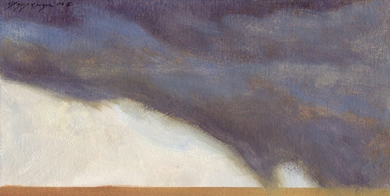
This is a small oil painting titled "Rain On The Flat." It measures 4 inches high by 8 inches wide.
I simplified the land/sky-scape, distilling it to two competing sky areas - dark and light - and a narrow strip of tan to indicate the land. I enjoy this particular theme and have painted several variations of it in addition to this one.
As for how are things going via Etsy, well, there are no sales yet, but plenty of visitors. Google Analytics shows I've had visitors from 39 states plus the District of Columbia. And visitors from around the world, including cities in the Netherlands, Norway, Germany, Australia, India, Pakistan, Israel, Greece, Poland, France, Portugal, Brazil, Russia and Belgium, just to name a few. Wow. As of today, I have 36 works of art listed for sale at my Etsy Shop, Poppenga Art Studio.
This is a small oil painting titled "Rain On The Flat." It measures 4 inches high by 8 inches wide.
I simplified the land/sky-scape, distilling it to two competing sky areas - dark and light - and a narrow strip of tan to indicate the land. I enjoy this particular theme and have painted several variations of it in addition to this one.
As for how are things going via Etsy, well, there are no sales yet, but plenty of visitors. Google Analytics shows I've had visitors from 39 states plus the District of Columbia. And visitors from around the world, including cities in the Netherlands, Norway, Germany, Australia, India, Pakistan, Israel, Greece, Poland, France, Portugal, Brazil, Russia and Belgium, just to name a few. Wow. As of today, I have 36 works of art listed for sale at my Etsy Shop, Poppenga Art Studio.
Thursday, January 20, 2011
Full Moon Setting over Prairie
The early morning drive to the school at Geraldine, Montana rewarded me with this fantastic westward view of the setting full moon. Wow!
The camera doesn't do this any justice. It may not look like it in this photo, but there is a deep barrow ditch immediately off the edge of the paved road so there was no place to pull over safely. I made a quick stop, hop out, snap the photo from the drive lane. Given more time (and a safer place to pull over) I would have tried some different settings on the camera. But I think this photo conveys the overall mood of the scene. The distant lights are the tiny community of Coffee Creek. The mountains (starting at the left) are the Highwood and to the far right is Square Butte.
What a nice way to start the day!
Monday, January 17, 2011
Etching Press - Session 2
This afternoon I created embossed designs on heavy watercolor paper with the press. The results were very good, but I'll have to figure out a way to photograph the work so it shows up. The scanner doesn't do very well when it's "seeing" just white paper with indentations in it.
The paper I used is some that I've had stored away for a long time. It is Arches watercolor paper and I'm guessing it is probably 300lb weight cold-press. This paper is heavy enough to take some real serious pressure under the press, but at the end of the session I wondered if a lighter weight and less textured paper might give even better results (and possibly with less pressure under the press.) The paper soaked in a tray of water for at least an hour before I used it.
I used scraps of mat-board (standard thickness) to make the raised areas of the designs. This works well enough but, as the printing process gradually compresses the mat-board pieces, there is a limit to the number of top quality embossings any one design can produce. In addition to the mat-board, I used some pennies.
There are plenty of other materials that can be used for the embossing - lots of other materials. And not only for embossing, but printing too. When I prepared dinner this evening, I noticed the styro-foam tray the pork steaks were packaged in has an interesting pattern on the bottom. Hmm. Maybe that tray can be inked and printed. I opened a jar of sauerkraut and thought, hmm, maybe the lid can be used for embossing. And on and on. So many potential objects - I will be counting them instead of sheep when I go to bed.
The paper I used is some that I've had stored away for a long time. It is Arches watercolor paper and I'm guessing it is probably 300lb weight cold-press. This paper is heavy enough to take some real serious pressure under the press, but at the end of the session I wondered if a lighter weight and less textured paper might give even better results (and possibly with less pressure under the press.) The paper soaked in a tray of water for at least an hour before I used it.
I used scraps of mat-board (standard thickness) to make the raised areas of the designs. This works well enough but, as the printing process gradually compresses the mat-board pieces, there is a limit to the number of top quality embossings any one design can produce. In addition to the mat-board, I used some pennies.
There are plenty of other materials that can be used for the embossing - lots of other materials. And not only for embossing, but printing too. When I prepared dinner this evening, I noticed the styro-foam tray the pork steaks were packaged in has an interesting pattern on the bottom. Hmm. Maybe that tray can be inked and printed. I opened a jar of sauerkraut and thought, hmm, maybe the lid can be used for embossing. And on and on. So many potential objects - I will be counting them instead of sheep when I go to bed.
Sunday, January 16, 2011
Etching Press - Session 1
This afternoon I dug out the Japanese rice paper I had squirreled away. Located the brayer, grabbed a tube of burnt umber oil paint, a generous pile of cotton swabs (Q-Tips), a bristle brush, and a clean cotton rag.
Then I taped a piece of acetate to a scrap of white matboard to serve as the "printing plate" for a session of experimenting with subtractive technique making several monotypes (or monoprints, which is what I believe they technically are called -- I'll delve more into that in another post later.)

This small print (Left) is the second one I pulled. The first one was too light. I decided it was not enough paint on the plate, so I really gobbed it on for this one. I think the thicker layer of paint is good up to a point. Too thick and it will "squish" under the press and all the linear marks and texture would be lost.
Print size is about 7 x 5 3/4 inches.
I used the cotton swabs in the dark passages. It didn't take much of a pass through the paint to completely filled a swab, so I used a lot more of them than I thought I would. In the detail photo (Below), you can see the cotton swab strokes cutting across the brushstrokes. I like the way that looks; it reminds me of some passages in the monotypes done by William Blake (1757-1827).
I was trying to get a sense of a storm cloud bearing down on the land, maybe even crushing (Detail above). I got some surprises with the cotton swabs--those that were "frayed" left more interesting "starting" and "stopping" marks.
This next print (Above) scanned as if it were brownish -- which it should be, as I used burnt umber. Print size is about 4 x 8 inches.
This print (detail at Right) was the result of partially cleaning the plate with mineral spirits and then deciding I liked what remained after the first wipe of the rag. So I went from there and invented something of a prairie landscape with patches of snow in it, some sagebrush and distant mountains or hills. I used both ends of the brush (bristle and handle tip) along with cotton swabs. The texture of the paper is very evident in this print. I need to think about how to take advantage of the paper texture.
This print (Left) started with a REALLY thick, tacky layer of paint on the plate. I didn't think it would work very well, and the only reason it worked at all was because I was aggressive with the used of the rag. I think I wasted a bit of paint on this one.
I should mention here that the clean edges around the first two prints are the result of taping off the image area before rolling out the paint and creating the image. The tape has to be peeled off before running the plate under the press and it was sorta messy, so I decided not to continue taping the plate off for each print.
I like the random edge made by the brayer better than the clean edge left by the tape.
The detail (Right) shows the amount of detail I was able to achieve on such a small format using just the swabs and rag.
Print size is about 5 1/2 by 7 1/2 inches.
This next print is even smaller than the others. It is about 3 1/2 by 3 1/2 inches. The ridge appearance was left not by a brush but by the rag. It must have been the way I held it, because I went through another several prints trying to duplicated that and it didn't quite repeat in this way. I think it has an appearance that is almost like wood grain. I used the handle of the brush to make some of the contour lines.

The detail (Right) shows areas where the paint itself is suggestive of form with no real "help" from me. I like that!
And what's a studio without a fruit still-life? So here's mine for the day -- an invented pear.
I like this print. I like everything about it. I suppose when I look at it again tomorrow, I'll find all kinds of things in it that I don't like. But for now it's of interest. I especially like the irregular border edge of the image. It makes the taped-off "perfect" edge seem boring. I tried a little yellow ochre in this print. I wasn't happy with how that color printed; it's too dull compared to the result I'd envisioned. Next time I'll try a cadmium yellow or even a lemon yellow.
Print size is about 9 x 6 inches.
The detail (Above) shows what I achieved with the stem. I was really surprised by the printed image versus what I saw on the plate.
This detail (Right) shows the upper left corner of the pear print. I was very excited to see how the layers of paint retained their own individual characteristics, texture and shape. I must have the press pressure about right for the amount of paint I was rolling onto the plate by the time I got to this particular print. Hmm. I see that the thinnest (most transparent) layer of paint is what the scanner saw as brownish and the progressively thicker (more opaque) layers it saw as somewhat blackish.
This (Below) is the last print of the session. I don't think it is necessarily the best of the session. Just the last. By this time I was becoming more comfortable with the speed at which I needed to be creating the images so that the paint would be fluid enough to transfer with the printing press.
I applied a thicker layer of paint onto the plate for this image and then tried to realize the image as quickly as possible. The result was more of a dark/light contrast rather than any real subtle shifts from dark to light or vice versa. I'm not sure I like the resulting print quality of this manner as well as the earlier ones. Print size is about 8 1/2 by 5 1/2 inches.
The detail (Right) shows strong decisive directional strokes or passes with brush and rag. I didn't use the cotton swabs on this print.
Another detail (Right.) I really tried to build form with just two or three values. Actually, only two values; the middle tones are the result of paint film left behind by the rag. If I wiped out too much, I simply added more paint with the brush.
All in all, the printing session was productive, not only in numbers of monotypes printed, but also in what I discovered in the process.
Then I taped a piece of acetate to a scrap of white matboard to serve as the "printing plate" for a session of experimenting with subtractive technique making several monotypes (or monoprints, which is what I believe they technically are called -- I'll delve more into that in another post later.)

This small print (Left) is the second one I pulled. The first one was too light. I decided it was not enough paint on the plate, so I really gobbed it on for this one. I think the thicker layer of paint is good up to a point. Too thick and it will "squish" under the press and all the linear marks and texture would be lost.
Print size is about 7 x 5 3/4 inches.
I used the cotton swabs in the dark passages. It didn't take much of a pass through the paint to completely filled a swab, so I used a lot more of them than I thought I would. In the detail photo (Below), you can see the cotton swab strokes cutting across the brushstrokes. I like the way that looks; it reminds me of some passages in the monotypes done by William Blake (1757-1827).
I was trying to get a sense of a storm cloud bearing down on the land, maybe even crushing (Detail above). I got some surprises with the cotton swabs--those that were "frayed" left more interesting "starting" and "stopping" marks.
This next print (Above) scanned as if it were brownish -- which it should be, as I used burnt umber. Print size is about 4 x 8 inches.
This print (detail at Right) was the result of partially cleaning the plate with mineral spirits and then deciding I liked what remained after the first wipe of the rag. So I went from there and invented something of a prairie landscape with patches of snow in it, some sagebrush and distant mountains or hills. I used both ends of the brush (bristle and handle tip) along with cotton swabs. The texture of the paper is very evident in this print. I need to think about how to take advantage of the paper texture.
This print (Left) started with a REALLY thick, tacky layer of paint on the plate. I didn't think it would work very well, and the only reason it worked at all was because I was aggressive with the used of the rag. I think I wasted a bit of paint on this one.
I should mention here that the clean edges around the first two prints are the result of taping off the image area before rolling out the paint and creating the image. The tape has to be peeled off before running the plate under the press and it was sorta messy, so I decided not to continue taping the plate off for each print.
I like the random edge made by the brayer better than the clean edge left by the tape.
The detail (Right) shows the amount of detail I was able to achieve on such a small format using just the swabs and rag.
Print size is about 5 1/2 by 7 1/2 inches.
This next print is even smaller than the others. It is about 3 1/2 by 3 1/2 inches. The ridge appearance was left not by a brush but by the rag. It must have been the way I held it, because I went through another several prints trying to duplicated that and it didn't quite repeat in this way. I think it has an appearance that is almost like wood grain. I used the handle of the brush to make some of the contour lines.

The detail (Right) shows areas where the paint itself is suggestive of form with no real "help" from me. I like that!
And what's a studio without a fruit still-life? So here's mine for the day -- an invented pear.
I like this print. I like everything about it. I suppose when I look at it again tomorrow, I'll find all kinds of things in it that I don't like. But for now it's of interest. I especially like the irregular border edge of the image. It makes the taped-off "perfect" edge seem boring. I tried a little yellow ochre in this print. I wasn't happy with how that color printed; it's too dull compared to the result I'd envisioned. Next time I'll try a cadmium yellow or even a lemon yellow.
Print size is about 9 x 6 inches.
The detail (Above) shows what I achieved with the stem. I was really surprised by the printed image versus what I saw on the plate.
This detail (Right) shows the upper left corner of the pear print. I was very excited to see how the layers of paint retained their own individual characteristics, texture and shape. I must have the press pressure about right for the amount of paint I was rolling onto the plate by the time I got to this particular print. Hmm. I see that the thinnest (most transparent) layer of paint is what the scanner saw as brownish and the progressively thicker (more opaque) layers it saw as somewhat blackish.
This (Below) is the last print of the session. I don't think it is necessarily the best of the session. Just the last. By this time I was becoming more comfortable with the speed at which I needed to be creating the images so that the paint would be fluid enough to transfer with the printing press.
I applied a thicker layer of paint onto the plate for this image and then tried to realize the image as quickly as possible. The result was more of a dark/light contrast rather than any real subtle shifts from dark to light or vice versa. I'm not sure I like the resulting print quality of this manner as well as the earlier ones. Print size is about 8 1/2 by 5 1/2 inches.
The detail (Right) shows strong decisive directional strokes or passes with brush and rag. I didn't use the cotton swabs on this print.
Another detail (Right.) I really tried to build form with just two or three values. Actually, only two values; the middle tones are the result of paint film left behind by the rag. If I wiped out too much, I simply added more paint with the brush.
All in all, the printing session was productive, not only in numbers of monotypes printed, but also in what I discovered in the process.
Subscribe to:
Posts (Atom)